
To plot a table of means following an analysis of variance, click Further output then click Means plots.
For a one-way table you must supply the factor for the x-axis, and for a two-way table you must supply the grouping factor as well. If the x-axis factor and grouping factor are left blank the first two-way table of means in the analysis is plotted (i.e. for the first two-way interaction in the treatment factors), or the first one-way table if there are no two-way tables. For multi-way tables the means can be displayed in trellis plots or using page factors to draw graphs on different pages.
Available data
This lists factors that can be used for the x-axis, Groups or Trellis groups. Double-click a factor name to copy it to the current input field or type the name.
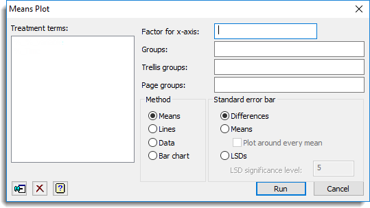
Factor for x-axis
Specifies the factor to be plotted on the x-axis. Corresponding y values are the means at each level of the x-axis factor.
Groups
If there are two or more treatment factors you can specify factors to use for additional classification on the plot. The means are calculated for each combination of x-axis factor and Groups, and a different colour is used when plotting Means, Lines and Data for the different groups, according to the choice of Method. For multi-way tables a list of factors separated by commas or spaces can be supplied to display the means for each combination of the grouping factors.
Trellis groups
If there are several treatment factors you can specify factors to define a trellis plot where a different plot is produced for each level of the factor. You can supply a list of factors, separated by commas or spaces, to display a plot for each combination of the trellis grouping factors.
Page groups
If there are several treatment factors you can specify factors to define combinations of levels to be plotted on different pages. You can supply a list of factors separated by commas or spaces to display a plot for each combination of the page grouping factors.
Method
This controls how the means are displayed.
| Means | Represents each mean by a point |
| Lines | Also plots lines between the means |
| Data | Plots the observed data values with lines between the treatment means |
| Bar chart | Plots the treatment means as a bar chart |
Standard error bar
The plot includes a bar to indicate the variability of the means. This option can be used to control which standard error is used for the bar.
| Differences | Average standard error of difference |
| Means | Average effective standard error for the means. By default, a single bar is produced for the graph. However, you can specify to plus and minus the effective standard error around every mean by selecting the Plot around every mean option. |
| LSDs | Average least significant difference. You can specify the significance level for the LSD in the LSD significance level option where the value is supplied as a percentage. |
Action Icons
| Pin | Controls whether to keep the dialog open when you click Run. When the pin is up |
|
| Clear | Clear all fields and list boxes. | |
| Help | Open the Help topic for this dialog. |
See also
- Graphics Plot Table menu
- AGRAPH procedure for plotting means